

This quick tutorial will specifically help you change all your checkboxes and radio buttons to use icons from the Divi font library (as seen in the blurb module). Here’s the key to it all: you can’t style checkboxes and radio buttons. They’re form elements that are set by the operating system (which is why they look so different on a Mac than on Windows). But, fortunately, we can hide the original checkbox/radio button, and replace it with something else. That means the solution here is entirely CSS, that can be added to the “Custom CSS” section of the ePanel (Divi > Theme Options).
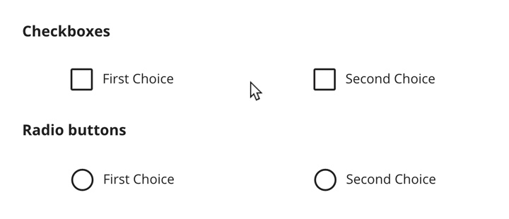
Here’s what the results look like:
This should work for all checkboxes on your site, including WooCommerce, Gravity Forms, Caldera Forms, Ninja Forms, WP Forms, and checkboxes in your comment forms and elsewhere. Though you just might need to add a little positioning, depending.
Hiding the Default Checkboxes & Radio Buttons
The CSS is down below. This is an explanation of what you’ll find there. “Section 1” hides the original OS-controlled checkbox and radio button. The next section sets the pointer to look like the label is clickable, and sets the Divi font as well as the size it should display at, for the “:before” pseudo element. This “:before” element is what allows us to insert the font character/icon in front of the checkbox/radio button. But since we already hid it, it’ll replace the original checkbox/radio button.
Adding Divi’s Icons
So now we need to tell that :before pseudo element to display characters from the Divi font, depending on the state of the checkbox.
“Section 2” of the CSS below tells it to insert a “56” character before the label. The “56” in in the ETmodules font is the empty box icon. Line 2 makes it so that when you hover over it, it shows a lighter version of the checked box (“5a” character), indicating that clicking will check it.
If you don’t like this hover effect, just remove the lines that have “:hover” in part of them from Section 2. The other lines set it to change to the checked-box icon, when it’s checked, and turn off the hover effect. This way you only get the hover effect when it’s not checked. The rest of the section repeats the same process for the radio buttons.
The Amazing CSS
/** SECTION 1 **/

/* Hide the OS/Browser checkboxes/radio buttons */
input[type=checkbox], input[type=radio] {
  visibility: hidden!important;
  margin: 0!important;
  width: 0!important;
}

/* Set Elegant Icont font, size, & positioning for the checkboxes/radio buttons plus the cursor on hover */
input[type=checkbox] + label:before,
input[type=checkbox] + span:before,
input[type=radio] + label:before {
  visibility: visible;
  font-family: "ETmodules";
  font-size: 30px;
  position: relative;
  top: 6px;
  padding-right: 8px;
}

input[type=checkbox] + label:hover,
input[type=checkbox] + span:hover,
input[type=radio] + label:hover {
  cursor: pointer;
}

/** SECTION 2 **/

/* Set checkbox to ET icons: normal, hover, checked, & checked hover */
input[type=checkbox] + label:before,
input[type=checkbox] + span:before {
  content: '\56';
}
input[type=checkbox] + label:hover:before,
input[type=checkbox] + span:hover:before {
  content: '\5a';
  filter: alpha(opacity=20);
  opacity: 0.2;
}
input[type=checkbox]:checked + label:before,
input[type=checkbox]:checked + span:before {
  content: '\5a';
}
input[type=checkbox]:checked + label:hover:before,
input[type=checkbox]:checked + span:hover:before {
  filter: alpha(opacity=100); opacity: 1;
}

/* Set radio buttons Divi icons: normal, hover, checked, & checked hover */
input[type=radio] + label:before {
  content: '\5b';
}
input[type=radio] + label:hover:before {
  content: '\5c';
  filter: alpha(opacity=20);
  opacity: 0.2;
}
input[type=radio]:checked + label:before {
  content: '\5c';
}
input[type=radio]:checked + label:hover:before {
  filter: alpha(opacity=100); opacity: 1;
}
Update 23 Feb 2018:
It was brought to my attention that the below CSS won’t work for the “terms and conditions” checkbox on WooCommerce as well as other situations where the “input” field is nested as a child of the “label” element. I thought we could move the :before pseudo-element to the input itself. Unfortunately, that breaks standards, and doesn’t work on browsers other than Chrome.
And there’s no pure CSS way to target the label parent of a checked input. So we’re stuck. The above is the best we get, and it won’t work anywhere the <input> is inside the <label>. I’ve added a specific case for the WooCommerce terms above, and opened the issue with WooCommerce. I encourage all plugin and theme devs to put the “input” after the “label” as a sibling, on checkboxes and radio buttons.
Note: if you use Divi & Gravity Forms, I highly recommend installing the “Surbma – Divi & Gravity Forms” plugin. It will style your Gravity Forms to look like the Divi contact form module forms.
How do I do this on a different theme?
This won’t work with themes other than Divi and Extra since they load the icon font used here. Though you could probably extract the font and load it manually, that’s outside the scope of this article. However, you could use Font Awesome to change your radio buttons and checkboxes in the same way. I wrote a separate guide for that.
Can You Help Me With This?
Is this too technical? Or maybe you’re just too busy? Sign up for one of our WordPress management plans, and we’ll do all this for you as part of the included design tweaks.


THANK YOU. This is so helpful. I was having the worst time trying to restyle the default checkboxes. These look great!
You’re welcome! So glad this helped, and thanks for letting me know it’s helpful. That keeps me motivated to share more stuff I learn.
How do I make labels bold and one size larger than the default size?
Please help
Dear Tevya,
I love your CSS but i’m not on divi but on wordpress. Do you know how to implement a bank of icon like font Awesome?
I love your result.
Rubiwane, you’d need to first get your site to load Font Awesome. You can add some code in a child theme: http://fontawesome.io/get-started/ or you could try a plugin like this one: https://wordpress.org/plugins/better-font-awesome/.
Once it’s being loaded, you’d just change the letters inserted using the “content” CSS (2nd box of CSS) to the desired Font Awesome code: http://astronautweb.co/snippet/font-awesome/. So instead of “content: ‘V'” in my CSS, you’d put “content: ‘f00c'” instead. Does that make sense?
Yes it is 🙂
Great! I’m actually working on a post about how to do this with Font Awesome.
Hey Tevya,
Excited about implementing this on my WordPress site but running into a problem. I have followed all of your steps but when I swap in the Font Awesome code ie “/f00c” the letters/numbers of the code appear and not the font icon. Have tried with and with the “/”. I have also checked that I have Font Awesome properly installed on my site.
Any ideas? Your help is more than appreciated!
Thanks
Corydon
Corydon, I’d have to look at it. Can I see where you have it installed? Feel free to reach out directly via our Contact form. I’ve not actually done it with Font Awesome, and don’t have time to setup a demo for it. But if I can look at the front-end of yours, I might be able to figure it out.
Love this tutorial, but I’m having the hardest time using a similar method with Caldera. Have you ever styled radio buttons and checkboxes using FA on a Caldera form, or are you familiar with why their form seems so differently built? I saw some comments on their site saying the button was nested inside the label tag.
I’d have to install Caldera somewhere. Any chance you have it on a live site that’s also loading Font Awesome so I can give it a shot via dev tools (won’t affect your site).
This is awesome and exactly what I was looking for! I managed to get it to work with FA as well using the same idea. Thanks!
This is exactly what I was looking for. Thank you! Any chance you could tell me how to convert radio buttons into large regular buttons? Thanks again!
What do you mean by “regular buttons”? You can stick HTML into the form, so like insert an image in there. Then just hide the little radio circle with CSS.
Is there a way to do this which doesn’t add 300kb of unused icons to the page load time?
Yes. You could make images and load those. But unless you do them as a sprite (lots more css involved) it’s going to mean more server requests. And if you’re already using Divi’s icons on a page, then this is getting loaded already.
Hi tevya
Looks great. 🙂 where should i put the second code? not into the custom css as the 1th code or?
Hi cas! Yes, both parts go into the same custom CSS field. I just separated them to explain what they do. It’s much harder to follow if it’s just one big block of CSS.
Sir, can we use RadioButtons and CheckBoxes for taking user input on the WordPress page?
Umesh, I’m not sure I understand what you mean by “WordPress page”?
Howdy looks great but not sure why I can’t get it to work using Divi with Contact form 7 or Formidable forms, shame I get a blank space for it, has the Divi font use changed? Are you using the latest Divi?
Cheers
I Theresa, I don’t think Divi changed it’s implementation. I’d have to tinker to see. I didn’t test with CF7 or Formidable Forms. But I’d be happy to take a look and see if I can help, if you want to reach out via our chat bubble or contact page.
Hi I worked it out using the span instead of label by adding this jquery
jQuery(document).ready(function( $ ) {
$(‘.with_frm_style .frm_checkbox input[type=checkbox]’).after(”);
});
thanks for the great styling and help.
It removed a bit of that in brackets as it thought it was code so that bit of jquery won’t work without the span in the last bit as it is missing:
You can also try our plugin Form Styler Ultimate.
With it, you can completely customize the look & feel of your radio / checkboxes on your Gravity Form (as well as every element of your form like inputs,labels, buttons,verification errors, confirmation messages, etc.)
Thank you
Hi Tevya. I’d just like to let you know that your styling is great – in Chrome and Opera; it does not work in Firefox and Edge though.
I’ve had a bit of a play with it and you need to style the and not the checkbox.
Here are my tweaks that helped me get around the Firefox issue.
(note that I’m only addressing the checkbox here and not the radio button)
After hiding the browser’s checkboxes:
.gfield_checkbox li label {
text-indent: -1.4em;
margin: 0 0 0 1em !important;
}
.gfield_checkbox li label:hover { cursor: pointer;
}
.gfield_checkbox li label:before {
color: #0c4da2;
font-family: “ETmodules”;
content: ‘\56’;
font-size: 22px;
position: relative;
right: 0.5em;
top: 4px;
}
.gfield_checkbox li:hover label:before {
content: ‘\5a’;
filter: alpha(opacity=20); opacity: 0.2;
}
.gfield_checkbox li input[type=checkbox]:checked + label:before {
content: ‘\5a’;
}
.gfield_checkbox li:hover input[type=checkbox]:checked + label:before {
filter: alpha(opacity=100);
opacity: 1;
}
Hi Reece, I guess I’ll have to look into that more. We had it loading on the label before. But unfortunately not all plugins put the label in the same relationship to the input. So on WooCommerce and other other places, it wasn’t working at all. Maybe there’s no pure solution, unless you write a bunch of browser-specific CSS, or write a bunch of plugin-specific CSS. Guess this is more complicated than I’d hoped.
So it should be noted the CSS in the post works for Chrome, but may not work elsewhere. While your modifications will work in Gravity Forms, but may not work elsewhere. Bummer… I may revisit this again in the future. But for now, we have a partial solution. ☹️
Okay, Reece, I’ve updated the above CSS to the best my research/brain could produce. It should work on Gravity Forms and WooCommerce, and most other places, on all browsers. But it may not, if the plugin/theme developer has put the input field inside the label, and not followed it with a span.
This was incredibly helpful; so glad I found it after working fruitlessly on attempting to do this myself for a couple of hours. Looks beautiful!
Is there a way to use CSS targeting to used different styled buttons for different checkbox lists?
Hi Jen! Yes, you could definitely use CSS to draw checkboxes of your own, or even use emoji for the checkboxes. The above CSS is a great base to start from, but you’d have to remove the parts that load the Elegant Icons font and replace with whatever you’re wanting to use for your checkboxes.