

The Give WordPress plugin by WordImpress is a great plugin for taking donations. However, I noticed a problem: for whatever reason they failed to style the email field and submit button that are shown for users to retrieve their donation information via a link sent to their email (no WP account required). It’s kinda strange, because the little notification telling you what to do has nice styles including an icon. By default those fields look like this: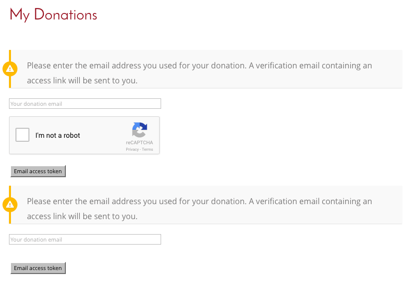
That’s a stark contrast to the Divi theme-styled login forms and buttons that appear on the rest of the site. Plus I combined the WooCommerce and Give account pages as explained in a previous post, so there are Divi-styled login forms just above those fields on the same page. The contrast makes them look even worse. So I set out to match them to the customized Divi styles that we had for the rest of this site.
Here’s the CSS I wrote. You’ll probably want to modify colors, border widths, padding, line height, etc, to match your site’s design. But at very least this should get you a good start in matching your settings in Divi, or whatever theme you’re using. I put the following CSS in the theme’s custom CSS field:
/** GIVE PLUGIN DONATIONS EMAIL FIELDS **/
form#give-email-access-form input#give-email {
 width: 100%;
 padding: 15px;
 border-radius: 3px;
 font-size: 14px;
 max-width: 305px;
}

form#give-email-access-form input[type=text]:focus {
 border-color: #2d3940;
 color: #3e3e3e;
}

input.give-submit[type="submit"] {
 font-size: 25px;
 border: 3px #97141b solid;
 font-weight: bold;
 background: transparent;
 color: #97141b;
 padding: 0.3em 1em;
 line-height: 1.7em;
 -webkit-transition: all 0.2s;
 -moz-transition: all 0.2s;
 transition: all 0.2s;
}

input.give-submit[type="submit"]:hover {
 background: rgba(0, 0, 0, 0.05);
 border-color: transparent;
 color: #2ea3f2;
 cursor: pointer;
 -webkit-transition: all 0.2s;
 -moz-transition: all 0.2s;
 transition: all 0.2s;
}
Now they look like this: NOTE: As outlined in that previous post, I’m using both the “give_subscriptions” and “donation_history” shortcodes in the same page. So that’s why the field is repeated twice on the login page in the screenshots. I’m still hoping Word!mpress will update Give WP to just display 1, when those 2 shortcodes are used in the same page. That just seems the obvious way to do it: show everything in 1 place. One sort-of work-around is to put in a “tabs” module and put them in separate tabs (if you’re using Divi or another page builder with a tabs option). That makes it look nice and people can see donation history or subscriptions with a single click, and without reloading the page. It also means they’ll only see 1 of these email access token prompts at a time.
Want Help With This?
We do customization like this for our members. Check out our WordPress maintenance and support plans. If you become a member, we can do this for you.


0 Comments